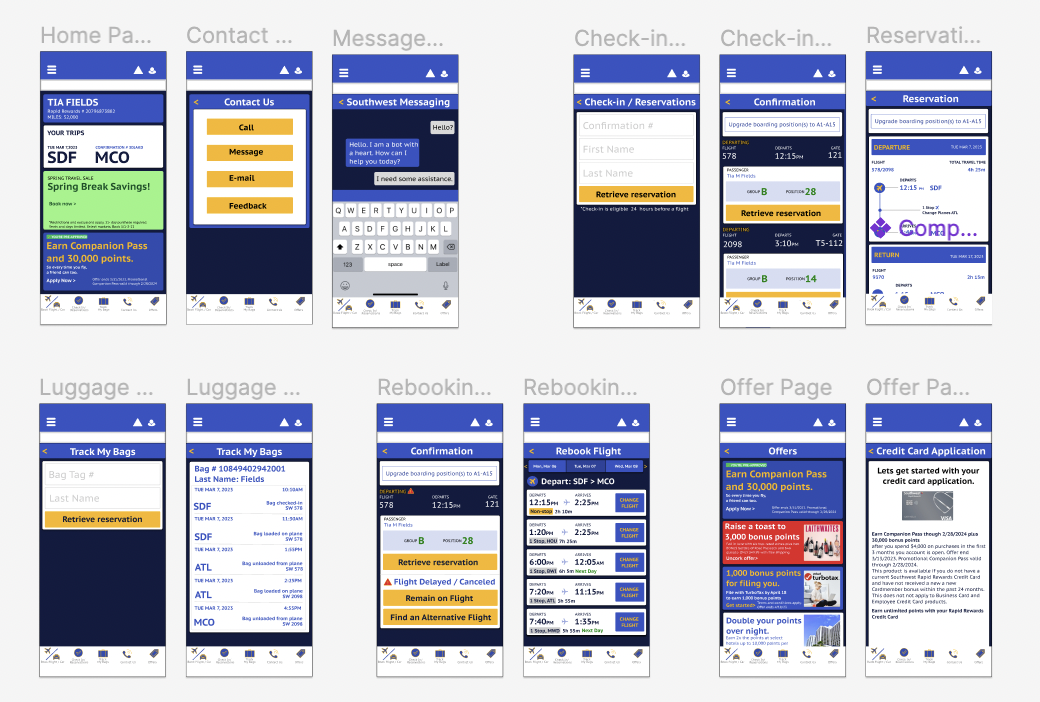
Role: UX / UI Design
Mocks: Figma
As a frequent flier I am constantly using different flight applications to check the status of my flights, book flights, check on luggage, etc. Due to the weather, the transportation of my recent trips has been very chaotic. I have flown Delta, United, Virgin, Southwest, KLM, and British Airways, the list goes on and on. The one airline application that always gives me issues is Southwest. I would like to reformat this application by adding new features and rearranging old features to make the application more user friendly where we do not have to rely on customer service.
In order to accomplish an improved experience, I needed to define what my success criteria looked like. I decided those should be as follows.
After determining the stakeholders and users. I was able to evaluate and define the current user journey. Where I analyzed the features I wanted to tackle and determine why they needed more attention. I then began working on a SWOT Analysis where I outlined the Strengths of the current application, defined its Weaknesses, Opportunities this company could have it added these features, and Threats other companies might have on Southwest Airlines. This was outlined in a Competitive Analysis where I compared Delta Airlines and Southwest Airlines messaging features and text alerts. Comparing a competitor Airline allowed me to gain more perspective on why Southwest needs to improve and cater to its customers.
Lastly, I selected my methodology of research and then tested this on my participants. I choose to use A/B, Multivariate testing. This is where I can present layouts and features to the test subject and then they could evaluate which interface they preferred. This helped me gather ideas of what the majority prefers and allows me to take into consideration what the users want and need. After synthesizing the data I was able to create "How Might We" questions where I can utilize these statements to help me further understand the user I am designing for.

In order to begin developing my application I created various tools to help me empathize with the user. I created several user personas, defined a user interface style guide, and generated a mood board for application inspiration. Then began developing my wireframes from there.
The final deliverable for my project included a Design Brief Document which includes all the documention for my Redesign of the Southwest application. It includes a Presentation Slide Show and a Prototype in Figma of the Final Product. Through the process of redesigning this application, it has allowed me to evaluate, test, and modify interfaces. I was able to empathize with the users through research and testing. I have gained a deeper understanding of how to develop interfaces through wireframes and prototypes. Lastly, I have improved my knowledge with Figma, which I can't wait to use for my future projects.
A selection of my range of work